
Our Services
From annual reports to brand identities. Designed to perform, built to last.
Design That Earns the Page, the Screen, the Shelf, and the Story
Pixel Prime is a full-spectrum design studio. From the quiet precision of an annual report to the loud confidence of a brand campaign, from the tactile detail of packaging and the craft of fine printing to the motion of a film and the architecture of a digital experience, we work across the disciplines that shape how a business is seen, understood, and remembered.
Every brief is approached with the same conviction. That design is not decoration, but a language. A language that builds trust, communicates intent, and gives a brand the form it deserves. The services below are the disciplines we practice. The standard behind each one is the same.
Tap the + icon next to any service to learn more.
Financial Reports
Award-winning annual reports and investor communication materials that transform complex financial and corporate information into compelling stakeholder-focused communication, combining strategic storytelling, premium design and clarity of presentation to strengthen credibility, investor confidence and long-term brand value.
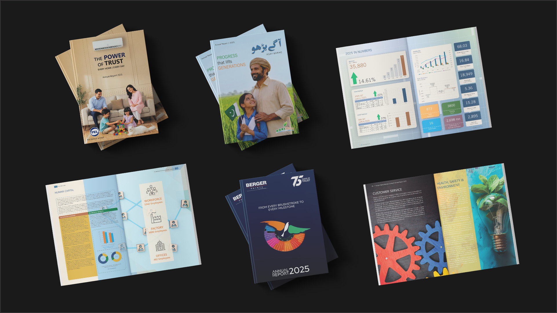
This is a glimpse of the work that built Pixel Prime. Financial Reports are the discipline we have refined for over a decade, and the practice we are most committed to. Everything else we do is held to the standard this work has earned.
Track Record
For over a decade, Pixel Prime has consistently been recognized at the Best Corporate Report Awards, jointly issued by the Institute of Chartered Accountants of Pakistan and the Institute of Cost & Management Accountants. Year after year, the reports we design have stood among the most awarded in the country. Not as a one-time achievement, but as a sustained record of excellence.
THE WINNING STREAK CONTINUES
A decade on the podium.
And we are not slowing down.
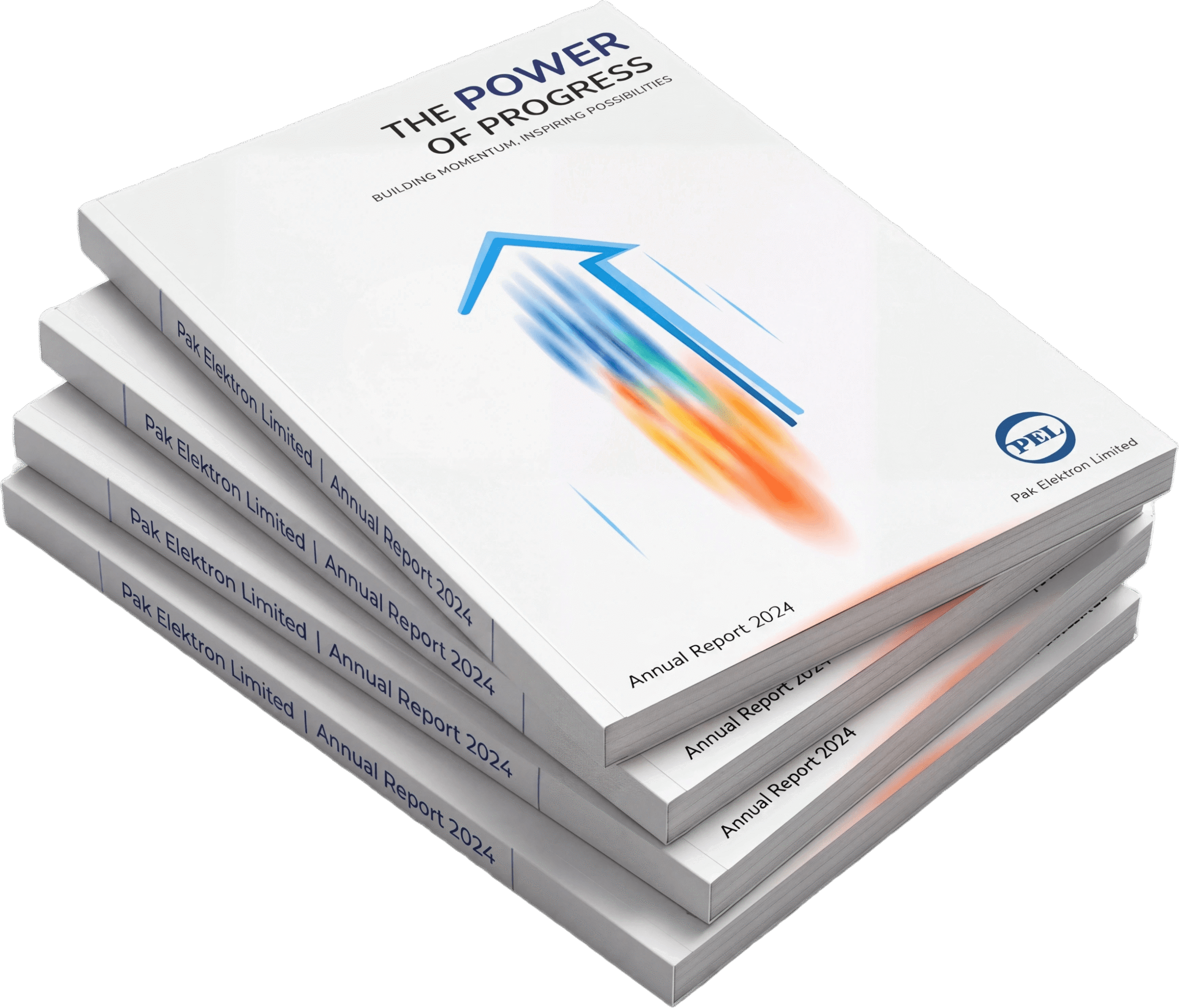
Pak Elektron Limited
Annual Report 2024
1st Position
Engineering & Autos Sector
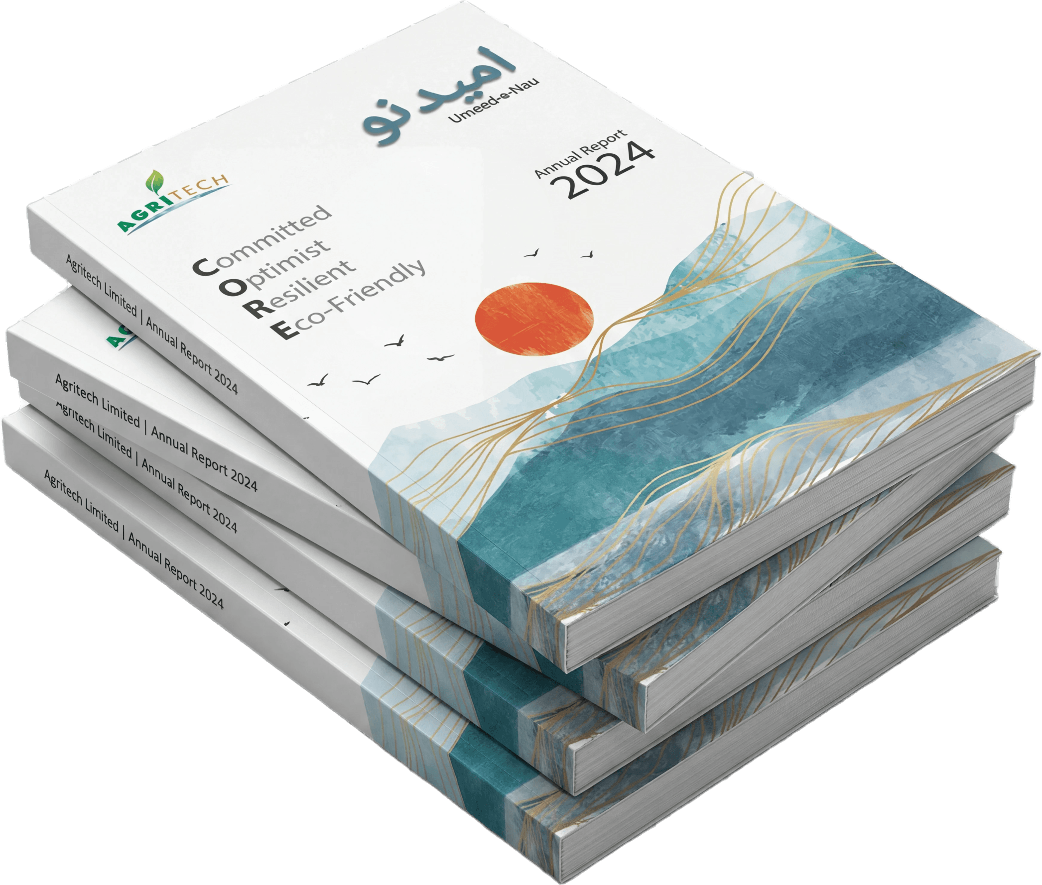
Agritech Limited
Annual Report 2024
4th Position
Chemical & Fertilizer Sector
Ten consecutive years on the podium. And the streak continues.
What Makes Our Reports Stand Out
“Most agencies see an annual report as a layout. We see it as the year’s most important conversation, with the people who shape how a company is judged.”
For most agencies, an annual report is a design assignment. A document to be styled, laid out, and delivered. We see it differently. An annual report is the single most important document a company publishes in a year. It is read by investors deciding where to allocate capital, by analysts forming opinions that move markets, by bankers assessing creditworthiness, by employees taking pride in where they work, and by competitors quietly studying your every move.
That document deserves more than design. It deserves judgment. The decision to lead with one number over another, to tell one story over another, to hold a piece of information back or place it on the cover, is rarely a design decision. It is an editorial and strategic decision. We treat it that way. The reports we produce read like considered communication, not corporate paperwork. The visual language reinforces the financial narrative rather than decorating it. And the result is a document a company is proud to put its name on, and a stakeholder is willing to actually read.
Why Clients Choose Us
“Engage Pixel Prime, and you do not onboard a design vendor. You onboard an advisor. Led by chartered accountants, fluent in regulation, and in your numbers.”
Six reasons our clients trust us with the most important document they publish each year.
Chartered Accountant at the Helm
The studio is led by a Chartered Accountant. Every project is shaped at the top, with the content read and understood before any page of design is approved.
In-House Accounting Review
Our accounting team critically reviews every figure, every footnote, and every cross-reference against the source documents. Errors are caught before the report ever reaches the press.
Financial Analysis Support
Hand us the raw financials. We build out the full analysis section, the trend commentary, the ratio analysis, and the data narrative, ready for client review and approval.
Content Development
and Review
We write fresh content where it is missing, and refine existing content where it can be stronger. Compliance with the integrated reporting framework is built in.
Designers Trained in Financial Data
Our designers specialize in financial data composition. Charts, infographics, and tabular layouts are built to communicate complex information with clarity.
Print as a Communication Tool
Other printers see an image to be reproduced. We see a critical disclosure document. Color, paper, finish, and binding are honored with the same rigor as the design.
Our Process
“In annual reporting, deadlines are not preferences. They are statutory obligations with public consequences. We treat them with the seriousness they deserve.”
Nine steps. Refined over a decade. Built around the rigor an annual report deserves.
Understanding the Year
We begin by understanding the year under review and the message the client wants to convey. Growth, recovery, momentum, or a defining milestone in the company’s journey.
Cover Page
The cover sets the tone. We define the punchline and theme with the client, then design a cover that captures the year’s defining message in a single visual statement.
Color Palette
Primary and secondary colors are locked at the start of the project. The palette is then carried consistently across every page, infographic, and visual in the report.
Typography
Font sizes, weights, and hierarchy are locked early. Consistency in type is what separates a polished report from one that reads as a collection of unrelated documents.
Page Layout
The grid is established before content flows in. A disciplined layout allows financial data, narrative, and visuals to coexist without the report ever feeling cluttered.
Content Development & Review
Client content is reviewed against the integrated reporting framework and BCR criteria. Gaps are filled with fresh writing, and every page is sharpened before layout begins.
Visuals
Infographics, icons, vectors, backgrounds, and photography are built for purpose, not decoration. Every visual is designed to make the underlying information easier to read.
Review & Revision
Every spread is reviewed by the design team, the accounting team, and the client. Each round sharpens the report until it is ready to carry the company’s name with confidence.
Publish
The report is finalized for both print and digital. Print runs are supervised on press. The digital version is optimized for fast loading, clean reading, and accessibility.
Why It Matters
“An annual report is not a design exercise. It is a regulated disclosure. We have spent a decade inside the frameworks that govern public reporting in Pakistan.”
Two companies. Same financials. Different annual reports. Two very different perceptions in the market.
The financials may be identical. The perception is not.
Ready to design your next annual report?
Advertising & Marketing
Premium brochures, flyers, product catalogs and marketing collateral crafted to communicate clearly, convert audiences, build brand recall and drive measurable results.
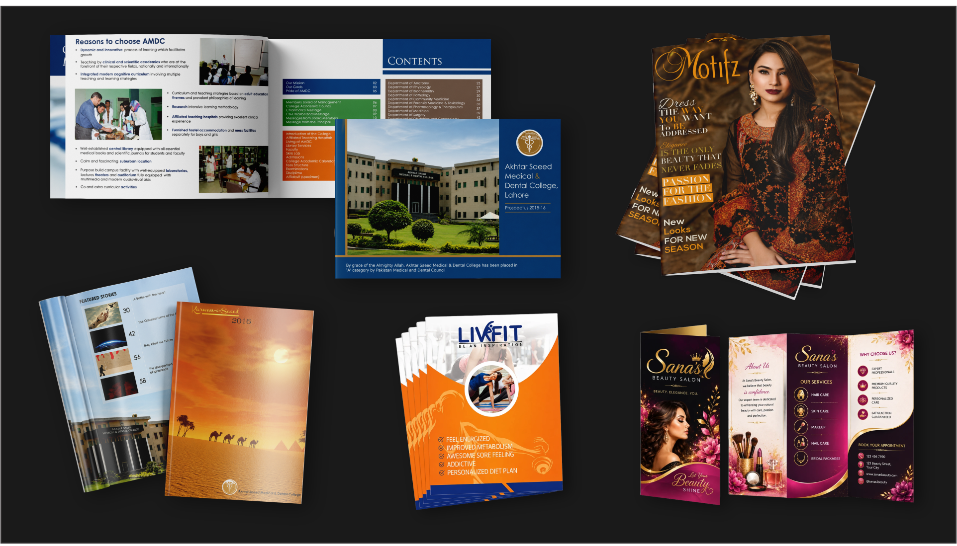
Designed for the moment it lands.
A brochure is read in under a minute. A flyer is judged in seconds. A product catalog earns its place on a desk only if it is worth opening twice. A college prospectus carries the reputation of an institution that has spent decades earning it. We design marketing collateral that survives those moments. Every layout, every headline, every image is placed with intent, so that when your audience encounters the work, the message lands clearly, the brand feels considered, and the response you wanted becomes the response you get.
What Makes Our Marketing Collateral Stand Out
“Marketing collateral is read by people who did not ask to read it. Our job is to make them want to.”
Three principles behind every piece of marketing collateral that leaves the studio.
Strategic Layouts
We design every page around a clear hierarchy. The reader’s eye is guided to what matters most, in the order it should land. No clutter, no guesswork, no wasted real estate.
Editorial Craft
Our typography, spacing, and image treatment carry the discipline of editorial design. The result is collateral that feels considered, not cobbled together from a template.
Built to Convert
Marketing collateral is not decoration. We design with the response in mind. The headline that gets read, the image that gets remembered, the call to action that gets noticed.
Have a project that needs the right hands?
Packaging
Innovative packaging design, custom boxes, labels and unboxing experiences that protect your products, elevate shelf appeal and turn first impressions into lasting customer loyalty.

Designed to be picked up first.
Packaging design is one of the hardest disciplines in graphic design. The canvas is small, irregular, and often curved. The reader is distracted, often skeptical, and almost never patient. The competition is shouting from every direction on the same shelf. Within those constraints, the design has to do more than any single page or screen ever has to do. It has to introduce a brand, communicate the product, signal the price tier, suggest the experience, earn trust, and stop the buyer’s hand long enough to be picked up. We approach every packaging brief as a design problem before it is a production problem. The illustration, the typography, the photography, the colour system, the hierarchy of information, the way the eye is led from the brand mark to the product name to the proof points, all of it is composed with intent. The container will protect the product. The design is what sells it.
Buyers Pick Up the Design Before They Pick Up the Product
“On a crowded shelf, the product is invisible. Only the design is seen.”
Here is how we make sure the design is what gets seen.
Designed to Be Seen First
On a shelf full of competitors, the design has to do the standing out. We use distinctive colour, illustration, and typographic choices that pull the eye toward the package before the buyer has decided what to look at.
Clear in a Glance
Once the buyer is looking, they have seconds to understand what the product is and why it matters. We design the hierarchy so the brand, the product name, and the proof points land in the right order, every time.
A Brand You Can Hold
The package is often the first time a buyer physically touches the brand. We make sure the typography, illustration, and visual system feel like an extension of the brand itself, not a template dressed up for the shelf.
Have a product that needs to stand out on the shelf?
Corporate Identity
Strategic logos, letterheads, business cards and complete brand guidelines that build trust, differentiate your brand and command instant recognition across every customer touchpoint.
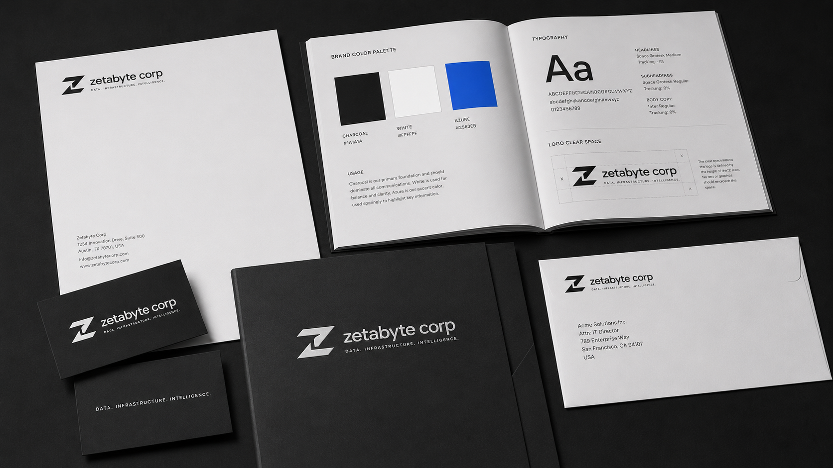
An identity is not how you look. It is how you are remembered.
A logo is the smallest part of an identity. The work begins long before the first sketch, in the questions about who the brand is for, what it stands for, and the impression it must leave behind in every room it enters. Identity is the discipline of building a system that holds up across a business card and a building, a website and a vehicle, a memo and a billboard. We design corporate identities the way they are meant to be designed: as systems, not symbols. The logo, the letterhead, the colours, the typography, the application across every touchpoint, each piece reinforces the next, so that recognition is not asked for. It is earned.
The Brand You Show Becomes the Brand You Are.
“The discipline of a brand is visible in the details no one was meant to notice.”
The disciplines behind every brand system we build.
Strategy Before Sketch
Every identity we design begins with the questions most agencies skip. Who is the brand for. What does it stand for. What impression must it leave behind. The mark, the colours, the typography all follow from those answers, never the other way around.
Built as a System
A logo on its own is not an identity. We design the full system, the wordmark and its variations, the colour palette and its rules, the typography hierarchy, the application across stationery, signage, and digital, so every touchpoint reinforces the next.
Documented to Last
Every identity we deliver comes with a brand guidelines book that protects the work for years. Logo clear-space, colour values, typography rules, do and do not examples. So that when the next designer touches the brand, the discipline of the original holds.
Have a brand that needs to be built, refreshed, or rebuilt?